
Why it’s important to clearly annotate your wireframes
What Are Annotations?
In wireframes, annotations are notes that explain the functionality and design of components. Brevity coupled with detail is key to successful implementation on your website.
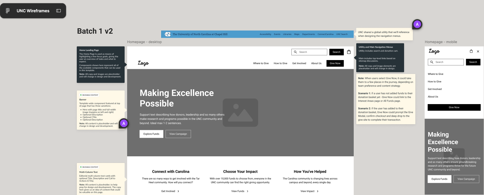
Before you hand-off your wireframes to a designer or developer, note helpful details beside components so they can build each content type correctly.
Whether on paper, in Figma, Miro—whatever you’re crafting wireframes, just add a little box with concise notes that clearly explain the name, purpose, and what’s happening in each component.
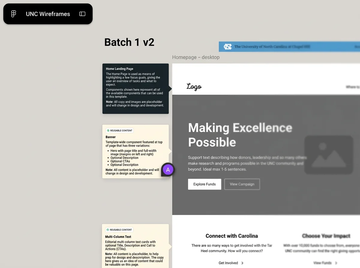
For UNC, I built higher resolution wireframes in Figma because this client wanted more visual guidance. The following wireframe example is a zoom-in of the home page wire, and you’ll notice a banner with placeholder copy and call-to-actions options. On the left, I annotated that this is a reusable banner, along with specs on the header and text, CTAs, and what else should be included for this component.
The annotation practice actually creates an opportunity to confirm functionality with your client—they may not need to know all the details of how and when to render elements like images, words, tags, but they may have a preference. For the banner, I took the opportunity to ask if UNC had large, high resolution images and videos. They did, and now their new home page banner works great!
When annotations are clear, your team and client stakeholders can scan to understand how the future design and functionality will work, and ensure it’s the best experience for their audience.
Prior to presenting to client stakeholders, I walked through wires and annotations internally with my lead designer and developer so we could discuss functionality, opportunities, and flag any concerns. I always initiate at least one internal collaboration session prior to a client call, and post links for review. In my experience, this helps me consolidate any questions for the client and ensures we’re proposing the best experience in scope.
Here’s my annotation checklist:
Name - Name the component, keep it broadly specific like “Hero Banner” or “News Collection Component”.
Media - Does this component allow video, images, etc.? Also include “Displays up to [numeral]” and if it’s automatic or manually curated.
Icons - Does this component allow icons? If so, note if it’s automatic, manually selected, and up to how many
Tags - Does this component show tags (e.g. news component that programmatically pulls in recent articles)? If so, note if it’s automatic via taxonomy or manually curated—align with the content model and taxonomy. I usually recommend automatically displaying content using taxonomy if possible.
Layout - Note if this component appears a certain way in desktop versus mobile (not ideal but sometimes preferable). If multiple pieces of content appear in the component, specify up to how many and where they go in the layout.
Reuse - Is this component locked in place or can it be reused across site pages? I recommend reuse unless there’s a specific reason not to (e.g. secondary hero banner designed only at the top of a certain page).
There’s a variety of ways to approach wireframes and annotations. They don’t have to be high res, really the point of wireframes is to confirm layout and functionality of content before getting to the design phase. This way, you can confirm layout, what displays where, and get client confirmation while reducing chances of change in the design and development phases.
You are the design expert and know your client—think about audience tasks, business goals, and recommend the best experience based on your knowledge. The client is the subject matter expert—ask them thoughtful questions and get data to back up your strategic decisions.
Is there a helpful gem missing from this post that you think I should add? Interested in more tips on content modeling, taxonomy, and more?
Connect with me on LinkedIn or email afoegelle@gmail.com