
I led content strategy on a Citi rewards app project that optimized the customer experience.
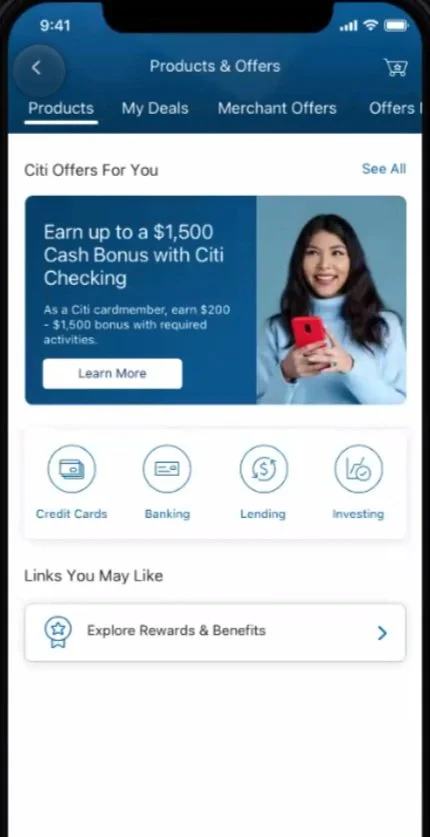
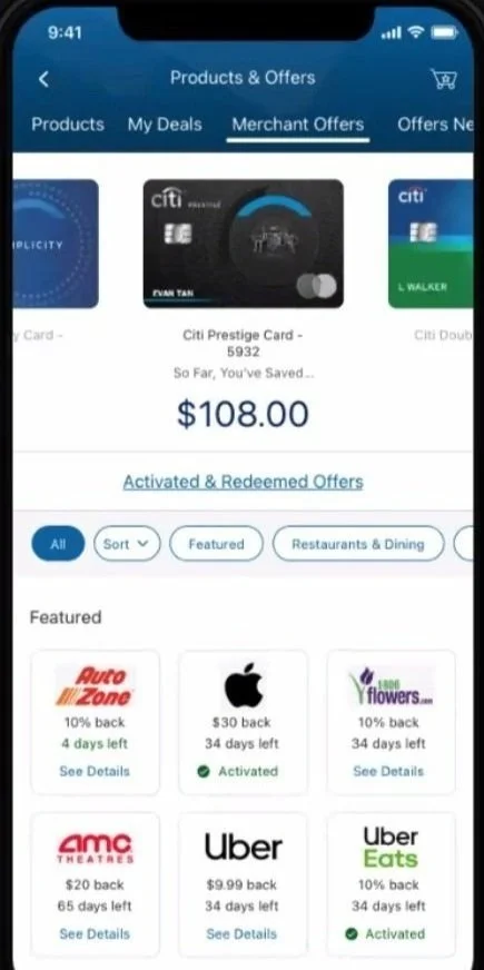
Objective: revamp ‘My Deals’, previously ‘Citi deals’, a tab/hub of rewards and offers in the Citi app.
Process
Design team collaboration in Figma
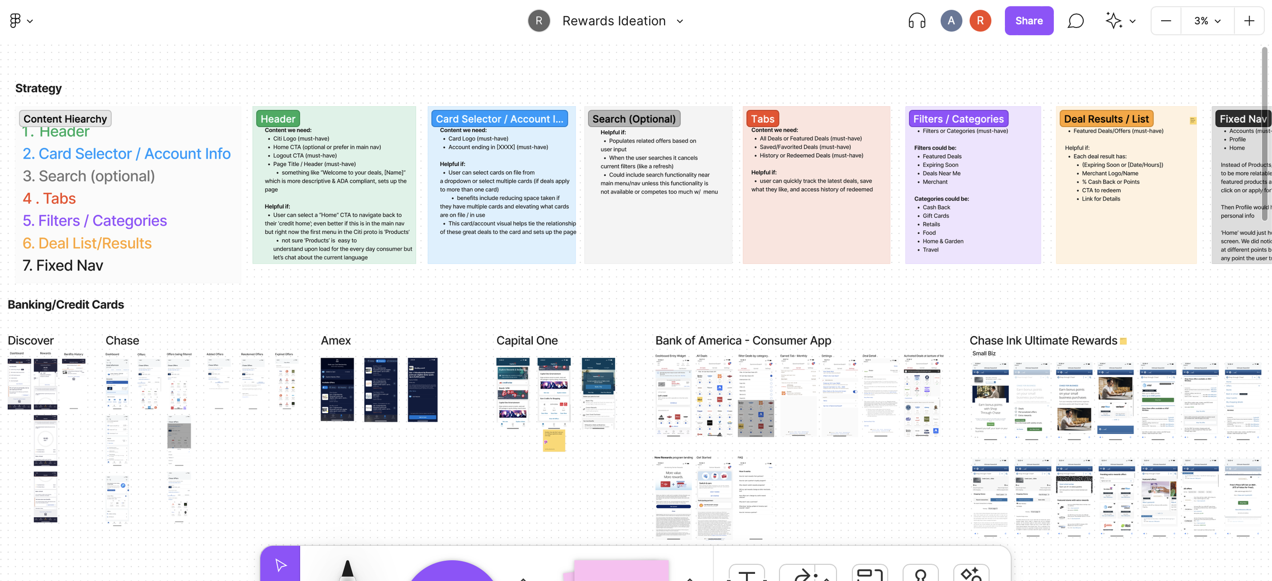
Competitive research and analysis to drive content recommendations and approach
Set up content hierarchy to list content opportunities for rewards tab
Multiple content quality reviews with feedback
Workshop and incorporate client and legal feedback
Opportunities
Build a story for scaling key results and learnings
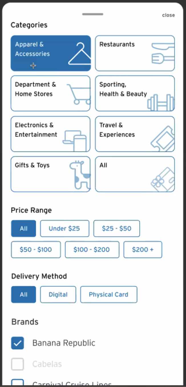
Consolidate rewards categories as research shows that advertisers prefer simple language
Modify messaging to be clearer and more straightforward between tabs and interaction points
Simplify user flows and interaction points to increase checkout completion rates
Present categories instead of showing a carousel with a link to show more
Team
Core Team: Content Strategist (me), UX Designer, UX Lead, Design Lead, Product Manager, Project Manager
Stakeholders: CD Lead, Client Digital Producers, Development team
Impacts
Positive leadership and stakeholder reactions
Adoption—lift, no negative trend
Reduced categories and unnecessary content for a cleaner experience across interaction points
New transactions feature with excited client feedback
Challenges and considerations
Need to unify experiences across My Deals (previously Citi Deals)
Help define My Deals user flows experience with data on what’s working or not working
Geolocation only supports up to .5 miles away from the user
Once a gift card is added to cart, provide clear, consistent communication and design patterns that indicate if it’s digital only or delivery method is by mail
Each individual level has a limit of rewards they can redeem; so if they are allotted seven apple gift cards in a given period, they’ll get an alert if they try to surpass that amount
Messaging should account for functionality to activate coupons and print or save to their device
Some merchants require a pre-text

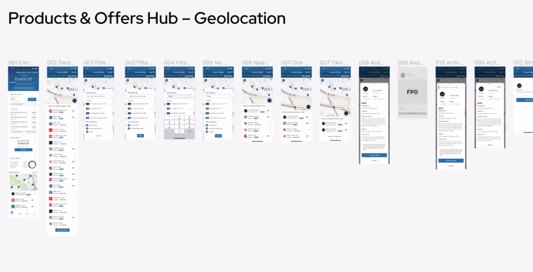
I worked closely with UX and visual designers to identify content gaps and highlight solutions across several scenarios and user flows. We laid out screenshots in Figma to help visually scan each page and interaction points across the board. This helped us understand a customer’s beginning to end experience, and lift pain points.
Core strategy: Improve the Citi app rewards dashboard by adapting data-driven, consistent content design patterns across the app experience.
Our team gathered competitive research and analysis, highlighting top findings and opportunities in Figma.
I worked in content hierarchy and opportunities to our Figma board so we could holistically chat about useful types of content, scenarios and build a roadmap for design implimentation.
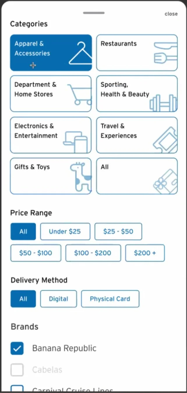
Content blocking and user research helped us determine and consolidate rewards categories that customers would be familiar with.
I used taxonomy exercises to help determine exact labels and terminology we would use for categories and related messaging, with data to support why.
Creating a new transactions feature
One of the most rewarding albeit challenging parts of the Citi rewards revamp was we wanted to create a new transactions view so the customer would be able to reference rewards they redeemed, the reward status, and any other helpful information they’d need.
Adding this feature provided clarity so the customer could track their rewards transactions and confirm whether they successfully completed a reward ‘order’. There were some technical limitations involved, but the end result got positive client feedback.
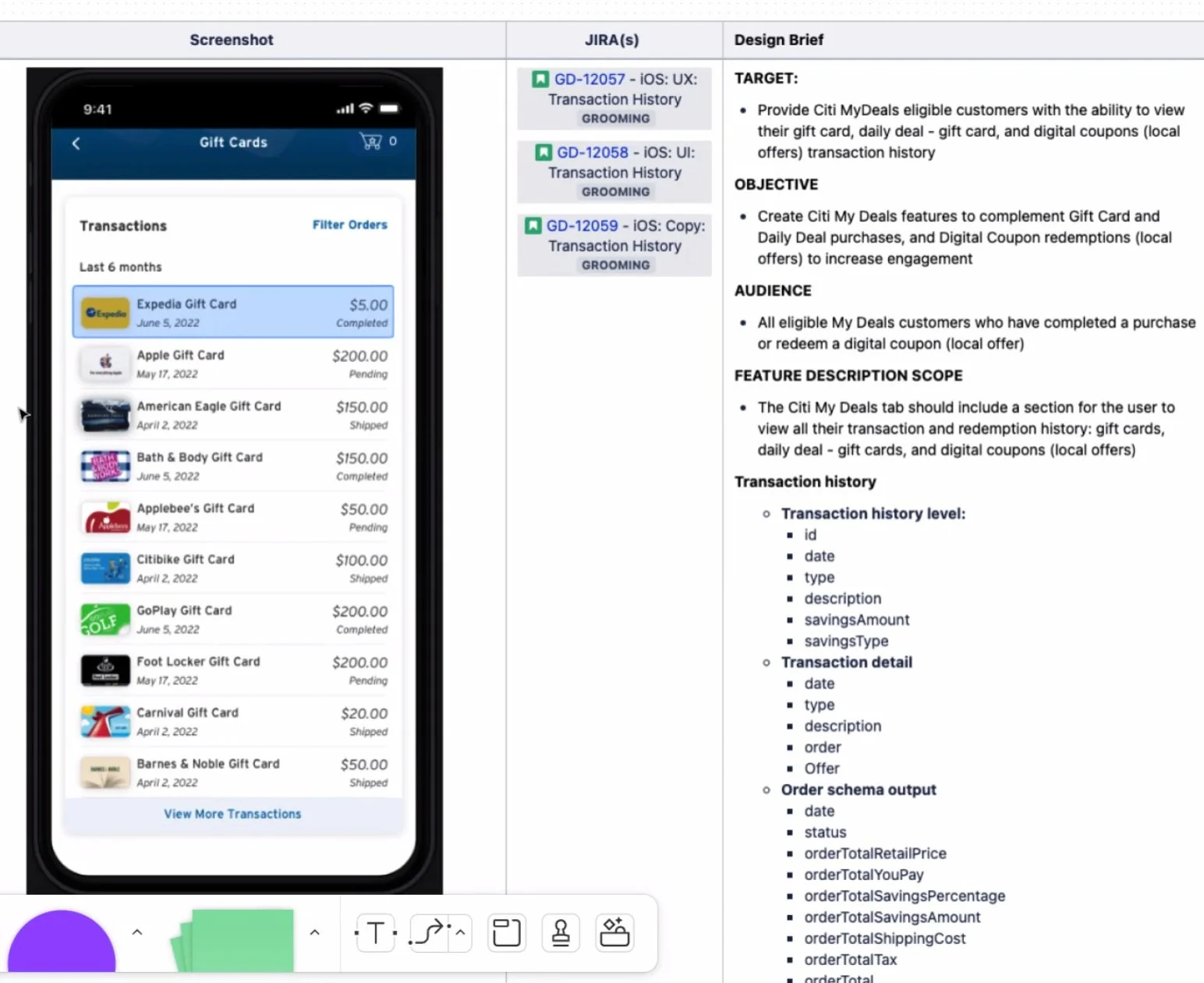

Image credit: @airamdphoto, unsplash.com
Positive results
Positive leadership and stakeholder reactions
Lift existing content design patterns with improvements
Consolidated categories (reduced confusion and unnecessary content)
New transactions feature with excited client and customer feedback
Although I wasn’t part of this project post-launch and do not have access to the Citi app experience, I would have loved to view and analyze some of the customer behavioral data after the New Deals updates went live.
Citi did provide excited feedback once this project went live, so we know there was successful impact!